Announcements
Flexible, fast, and responsive network and security analysis - advances in CloudShark 3.6
August 20, 2019 • 3 min read
Collaborative analysis that focuses on simplicity and speed is the new standard for how network and security professionals work these days. CloudShark was developed to resolve issues faster and applies this idea to packet captures. CloudShark 3.6, now available for CS Enterprise and CS Personal SaaS, takes these core concepts to a radical new level that is faster, more flexible, and more responsive than ever before. This makes it an extremely valuable upgrade for our CS Enterprise customers, with some excellent benefits:
All of the information you need, in record time, with our new packet capture view
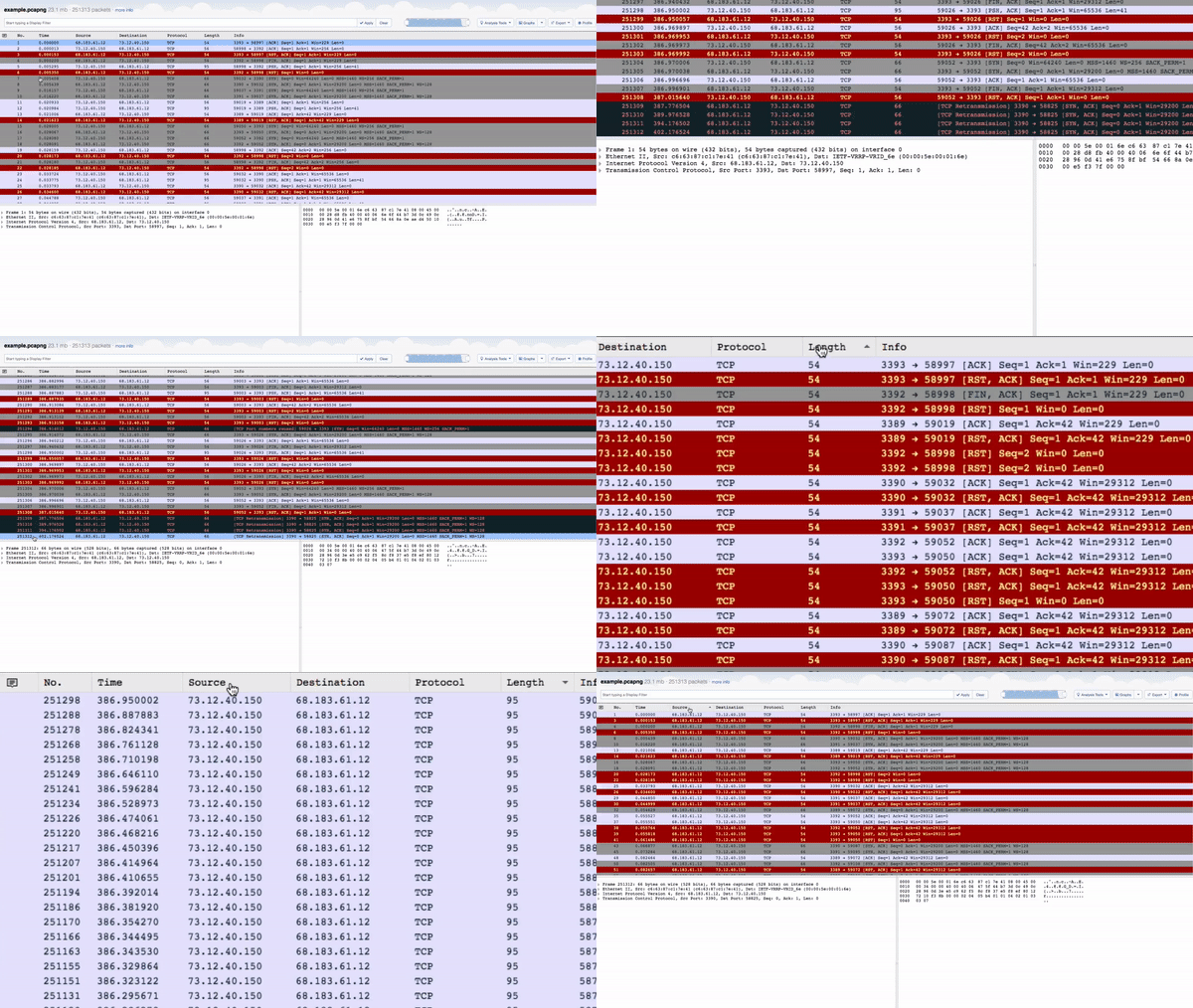
CloudShark 3.6 dramatically increases the amount of data you can analyze with new capture view technology. Load entire pcaps into your browser at once, with adjustable side-by-side frames. You can even jump to the end of a file instantly and sort the entire capture’s packets by column (one of our most requested features to date)!

New CloudShark Packet View
This is all possible due to our constant innovation. In July, we officially launched our CS TraceFrame devkit to add packet visibility to network and security monitoring tools. At QA Cafe we pride ourselves on building products that we would use ourselves. CS TraceFrame’s fast, responsive packet view is the power behind these new features in CloudShark.
More customization through our profile editor and annotation tools
Having the right view, with the right data and presentation for the problem at hand, makes capture analysis significantly easier. For experts, customization is key; you’ve found the best way to look at your data, and you want others to see exactly what you’re looking at. For entry-level analysts or managers looking at incident reports, these profiles help cut down on the noise when a capture can be easily shared with a particular view applied.
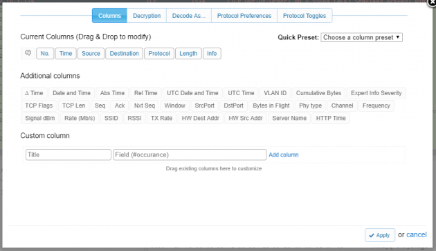
CloudShark 3.6 keeps packet view profile information all in one place. Add the specific columns you want (or pick one of our presets), add decode rules, apply decryption keys, and adjust more advanced preferences right from the new profile window.

CloudShark Profile Editor
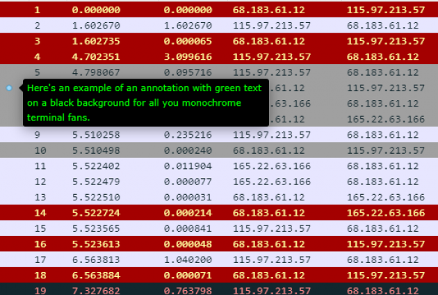
Packet annotations have been a go-to for CloudShark users since the beginning. We’ve advanced your customization options here, too, with an annotation editor that works even better in mobile, works with markdown syntax, and lets you customize the foreground and background of annotations. Now you can use different colors for different levels of severity, or just go “dark” for better visibility.

Custom Annotations
We’ve also made improvements to how annotations look when things get crowded. Try it out for yourself!
More great things to come
We’re very happy to bring you all of these improvements in CloudShark 3.6. For a detailed look, you can view the release notes here. Stay in contact and subscribe to our newsletter for additional updates, including our upcoming profile management system (to build and share your own packet preferences) and other great stuff we have planned for the next version of CloudShark.